

For marketers and web developers, there are 3 crucial tasks for search engine optimisation that you absolutely can’t overlook. Here, we’re going to cover the second of them –making your website mobile-friendly. If you haven’t read the first must-do about SSL / HTTPS, read it here.
Must-Do 2: Mobile-Friendly & Google Mobile-First
No matter where you go, there are always going to be people on their smartphone, or tablet.
At the cafe. On the bus. While shopping, or even at your family’s dinner table. Yes, mobile devices are in use literally everywhere.
Some of you might think it’s annoying. But as a company owner, you must recognize the significance of this increasing mobile use to your business.
Why is that?
Because it shows that more and more online traffic is moving to mobile devices.
In December 2019, stats from Statcounter, which analyzes billions of website visits each month, show that online traffic differs as follows:
Mobile: 53.29%
Desktop: 43.99%
Tablets: 2.72%
That means 56.01% of online traffic is now on mobile devices!
With over half of online traffic happening on smartphones and the like, you, as a business owner, must take the words “mobile-friendly” seriously.
If your website can not be displayed or is not working properly on a mobile device, you will lose customers. The numbers speak for themselves.
If your users can not find the information they need, cannot make a purchase, or cannot contact you via their smartphone or tablet easily, they will go to your competitor instead.
What is Mobile-Friendly?
To know what mobile-friendly is, let me first explain what it’s NOT:
Mobile-friendly does NOT only mean that your website can be viewed on a mobile device.
And it definitely does NOT mean that your pages are awkward to use and confusing to view on a smartphone or tablet.
Here are 3 important examples of what mobile friendly is:
#1. Responsive Design
A responsive website design scales the different elements of the site to fit the screen size it’s viewed at.
That’s why no matter what screen you use, a responsive website design will allow text, images, graphics, navigation, etc. to adapt to the device you’re using.
Previously, web developers created special mobile pages for their website that you sometimes see have an “m.” in front of the web address. Today, these mobile sites are made only if the existing design can’t be converted into a responsive design.
A “domain.com” and an “m.domain.com” are two different sites, and the load time is slower for a mobile site than a responsive one.
With that being said, discard your mobile website and make it responsive!
If you can’t make it responsive, it may be time to make a complete update of your site.
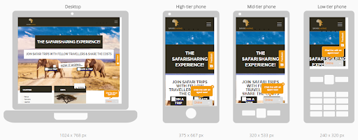
Example. This is a responsive design website viewed using different devices:
And as a comparison, here’s a non-responsive site:
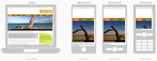
You can clearly see the difference.
On the responsive design (image 1) you don’t have to scroll sidewards to see the rest of the menu or page. You only have to scroll down to read the page – just as when you view it on a desktop PC. The navigation bar can be seen in the Burger menu at the top right of the screen.
One thing we also recommend is to turn off the pop-ups when viewed at a mobile device. It is annoying to have to close them all to read a page.
On the non-responsive design (image 2) only a fraction of the page is visible, and you have to scroll sideward to see the rest of the navigation menu, text etc.
Also, don’t force the user to be a finger magician!
Make sure that buttons and similar clickable and touchable items (links) are placed far enough apart so that the user can click on the intended button without touching the wrong one.
Google writes it this way:
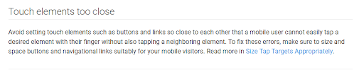
Check your site in mobile view and correct any bunched links.
You can check your website in mobile view here: search.google.com/test/mobile-friendly.
#2. You need to look at your navigation. Is it clickable?
Your finger doesn’t substitute for a computer mouse, so you can’t hover your finger on a link to drop-down. If your website is responsive there should be no issues with this.
A standard non-responsive website, however, will have problems when viewed through a mobile device.
#3. Non-conflicting Software
Software that is not used by mobile devices/operating systems should NOT be on your website. For example, Flash. If you use Flash on your website, find another solution.
If your creative web agency refuses to find another solution or say it does not matter, fire them!
Google will not consider the mobile version of your site as mobile-friendly if everything on the page cannot be displayed. Users who think your site is not mobile-friendly either will go to your competitor’s website.
This is how a website with Flash looks like on a mobile view. The brown/golden areas are images that appear in Flash, which are not shown in mobile view.
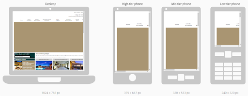
As you can see, the page does not appear responsively or as a mobile site, so you need to scroll sideward to view the entire menu and page content.
What is Mobile-First and why do you need to know? (must read!)
Mobile-First is Google’s new search index. Launched a few years ago, it only recently started to gain momentum. Now, Mobile-First is the search index to use.
There have been misunderstandings of what Mobile-First is, so let’s start with an explanation and after that, what to do.
Google’s index is a database containing copies of the websites/pages that Googlebot, a web crawler software, has discovered. Googlebot is scouring the world wide web for pages, a process called crawling, 24/7. So whenever you make a change to your website, Googlebot will store a new copy of it and put in on Google’s index.
When you make a search in Google, a query is sent to the index (database). The index will respond with all the relevant pages and rank them accordingly. Google will then show you its SERP, or Search Engine Results Page.
Google’s Index was previously based on desktop sites.
This means it was based on what the Googlebot Desktop Crawler found from crawling the internet.
At the same time, Googlebot Mobile Crawler was gathering information or crawling 24/7, despite the index still basing on the desktop crawler.
Confused?
Okay, it is a bit confusing.
Basically, what you need to know is that previously Google’s index had the copy of the desktop version of your website, and that is what was used for the rankings.
That was then. Now, Google has switched from a desktop index to a mobile index.
Mobile-First means that Google bases the index/database on the mobile version of your website. There will no longer be a separate mobile index and desktop index in use.
So, if you don’t have a mobile website, or better yet a responsive website, you will likely lose your rankings.
Let’s sum this up
To summarize Mobile-Friendly & Mobile-First
- Make your website “responsive”.
- Make sure buttons, links and touch items are easily clickable.
- Don’t use Flash and other conflicting software.
In the last article, we will look at the third of the 3 important SEO must-dos. If your website is loading at lightning speed and holds the record for being the fastest site in the world, no need to proceed to the next article. Otherwise, read it right here.


0 Comments